


CRUSHNESS
Fitness Meets AI-Powered Design
Why I Created This Project
After interviewing with a major U.S. fitness company, I realized my portfolio didn’t highlight enough consumer-facing products outside gaming.
Instead of creating a “fake screen” or a small feature, I decided to build a complete fitness app from zero - something that demonstrates product thinking, UX depth, engagement mechanics, and visual craft, using some new and exciting generative AI tools.
Crushness became my personal challenge: prove that my experience in mobile gaming can elevate wellness and turn consistency into something users want to come back for.
My Role
I designed Crushness end-to-end - from concept and flows to wireframes, design system, and final UI. I led the product thinking, UX structure, and visual direction, using AI tools to accelerate ideation and imagery while keeping all key decisions and creative strategy in my hands.

The Core Concept
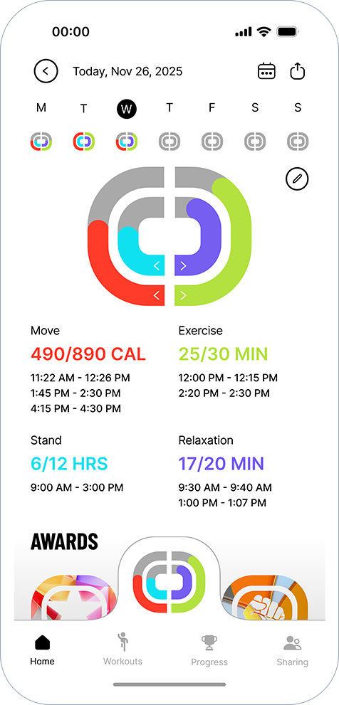
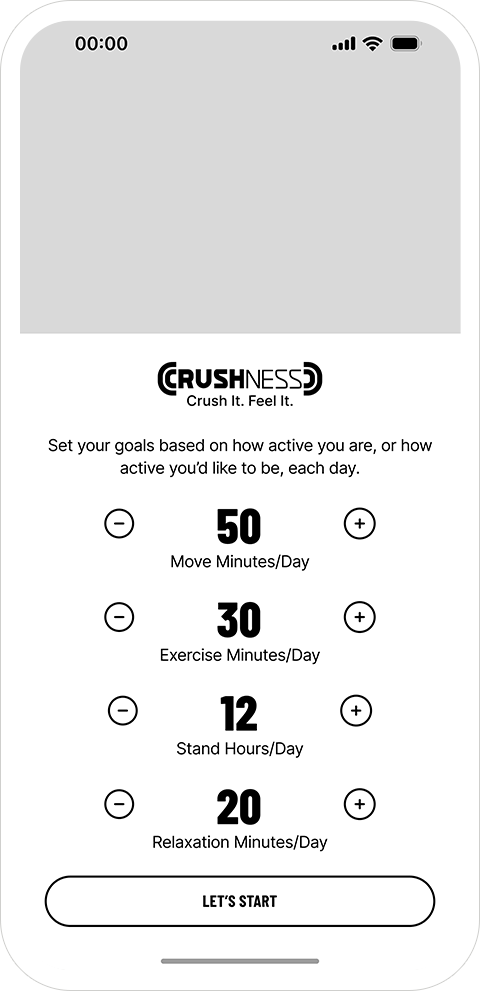
Most fitness apps track only movement. Crushness expands the definition of daily health by combining four dimensions:
Exercise

Move

Relaxation

Stand

I designed a new visual system of four arches, a reinterpretation of Apple’s rings, appearing in the logo, the bottom navigation hub, and the Progress screens.
These arches make the day feel more holistic, achievable, and emotionally rewarding.
They’re not just visuals, they are the operating system of the product.


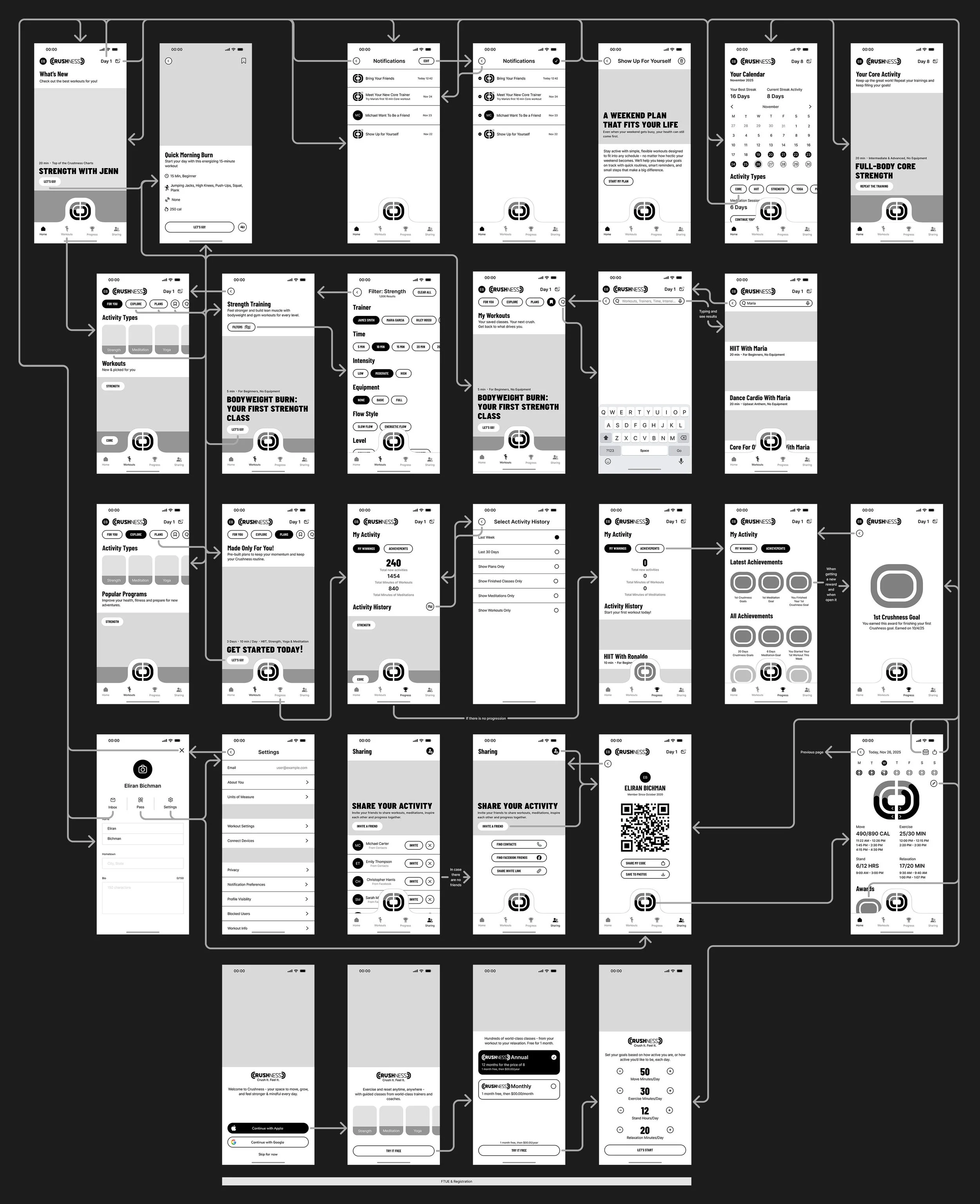
How Crushness Works
The product is organized around four main areas:
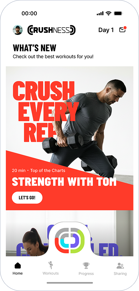
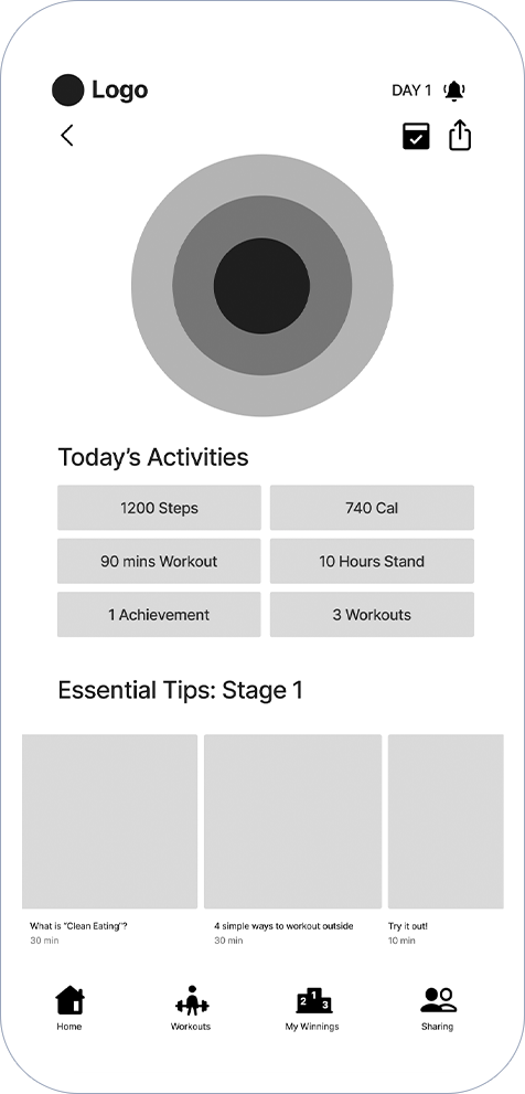
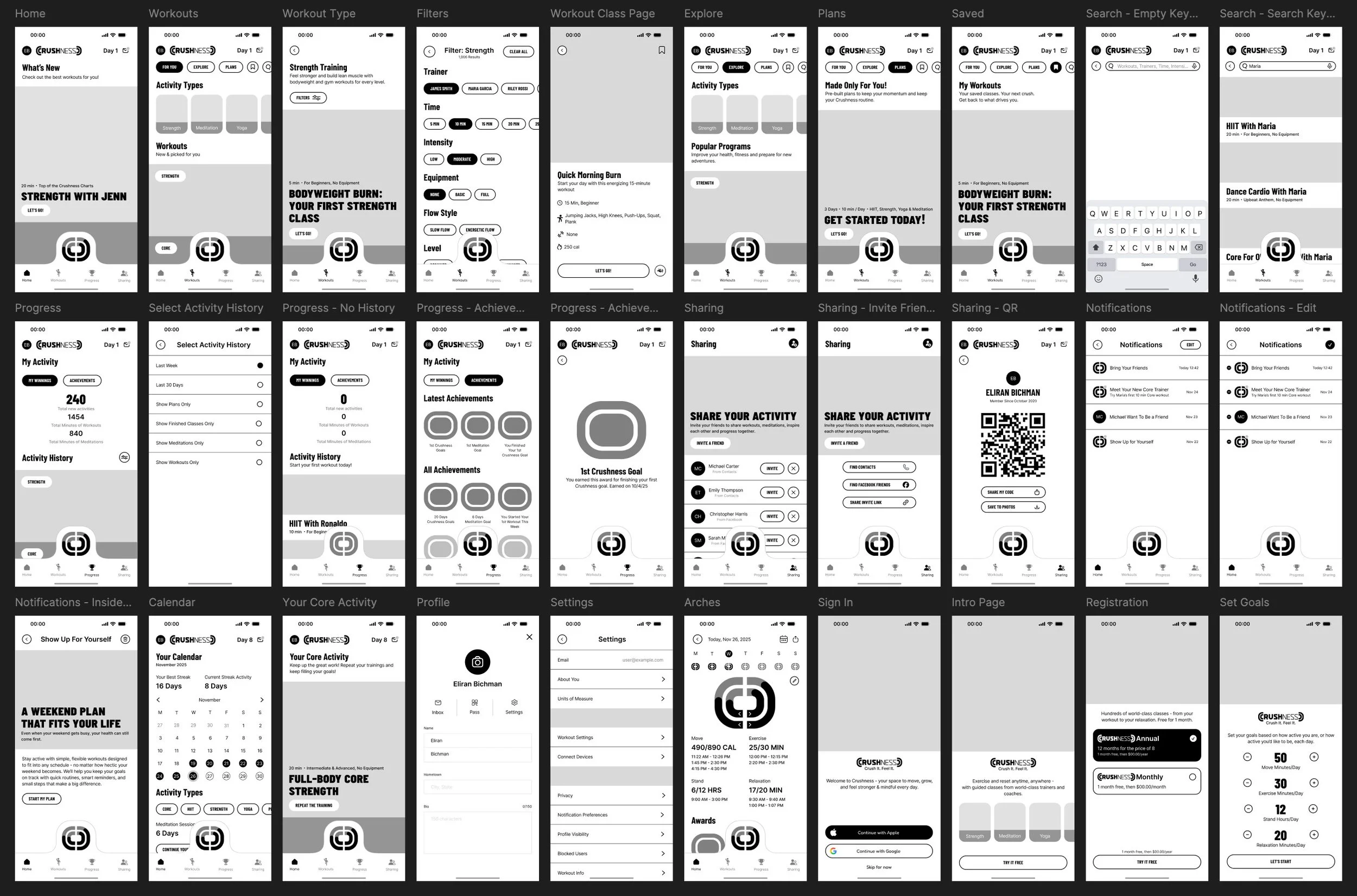
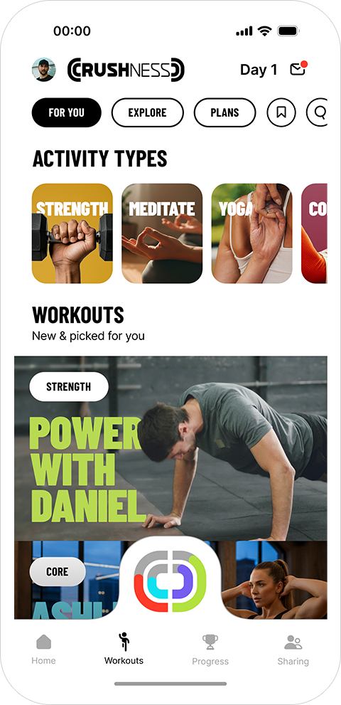
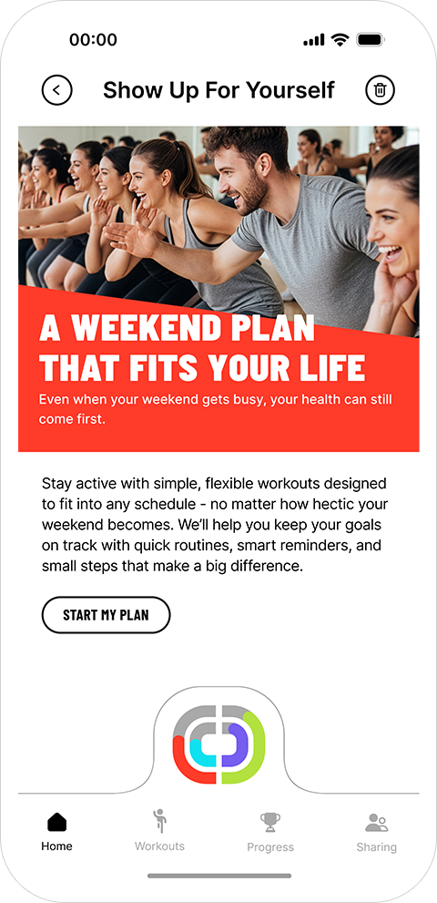
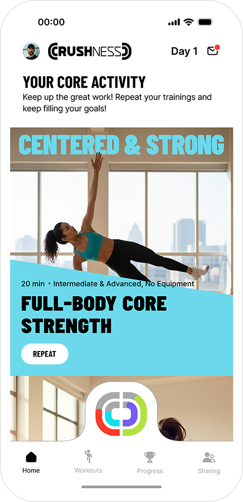
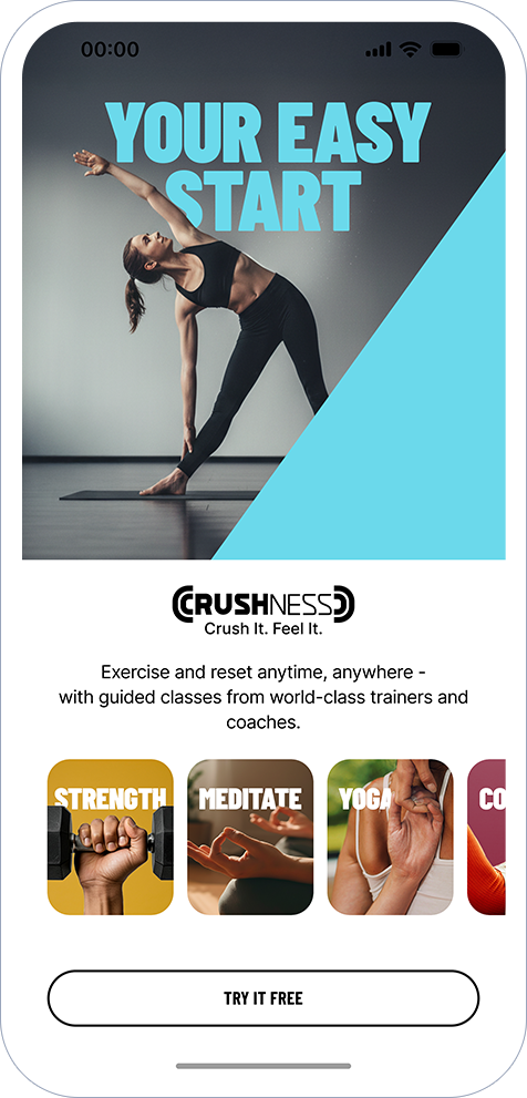
Home
A welcoming surface with quick-start workouts, personalized suggestions, and a persistent arches hub.
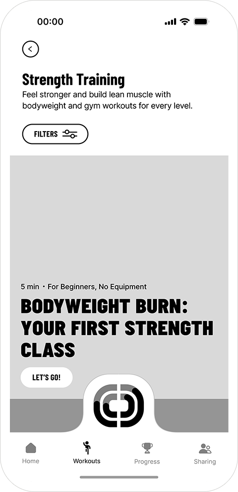
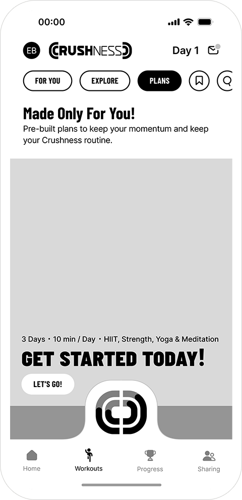
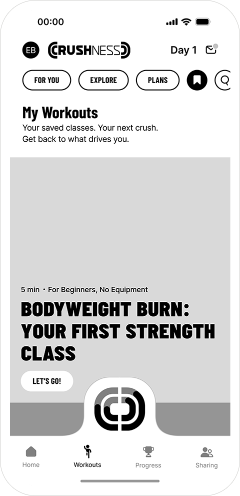
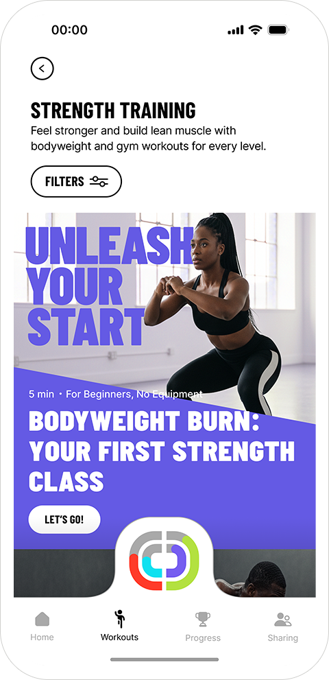
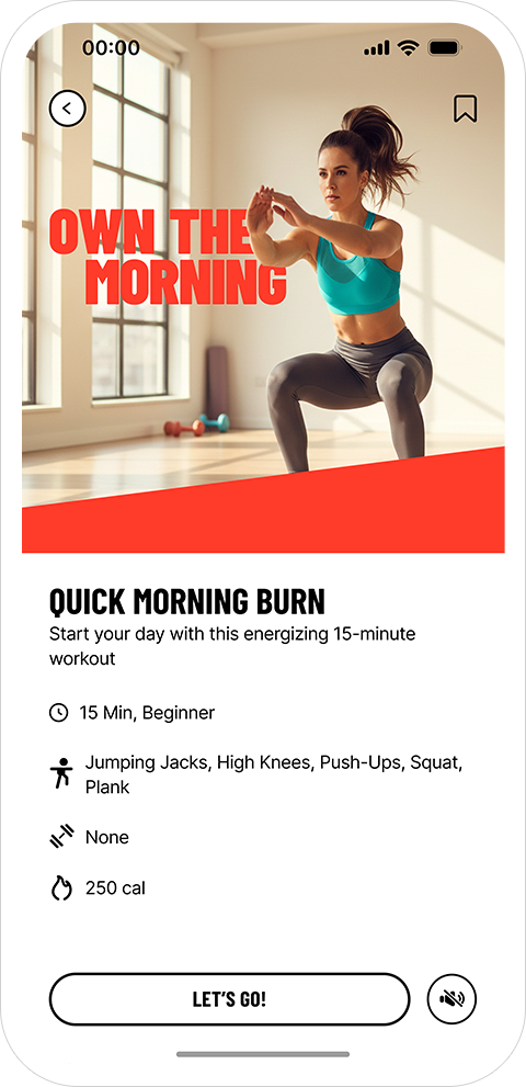
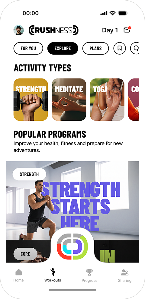
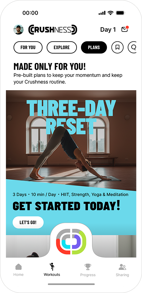
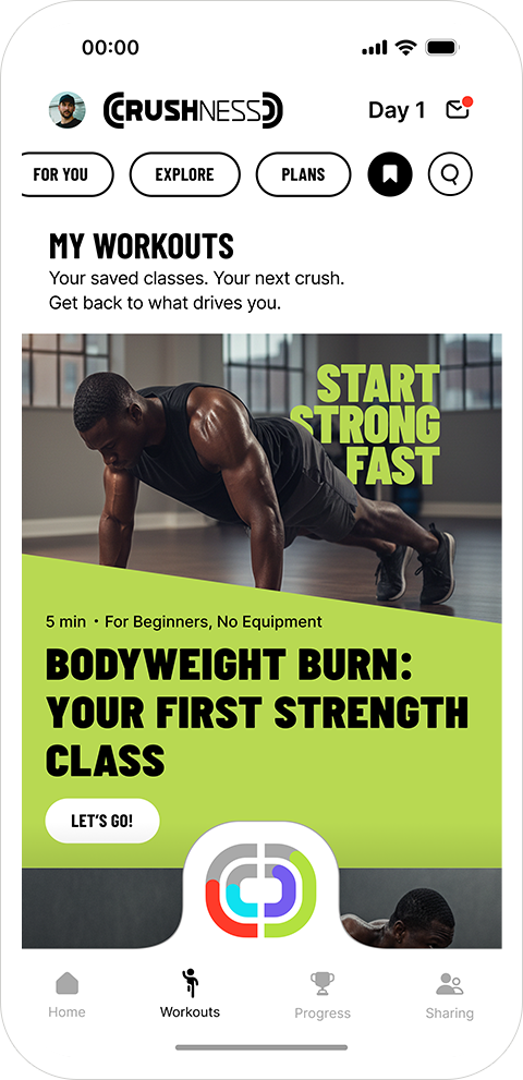
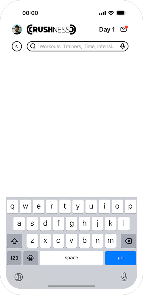
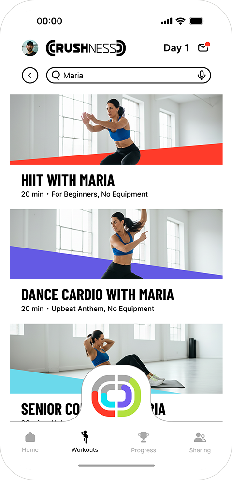
Workouts
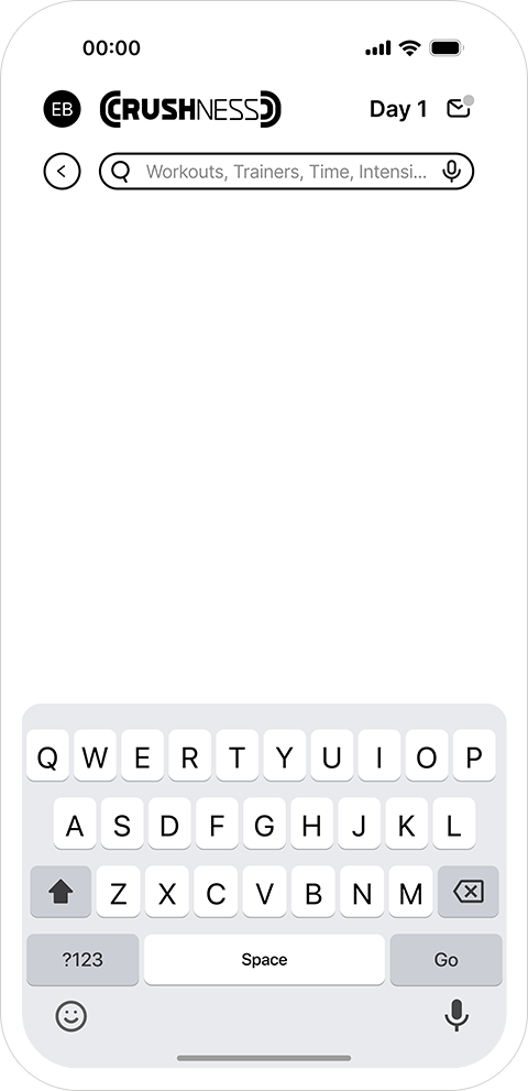
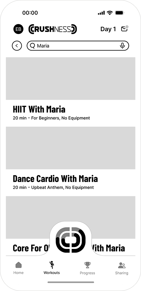
A multi-tab experience, For You, Explore, Plans, Saved, Search, designed to help users discover the right workout quickly without overwhelming them.
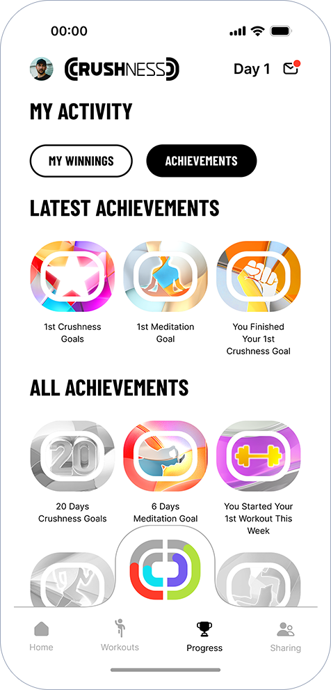
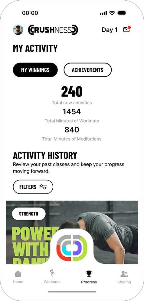
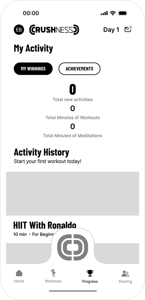
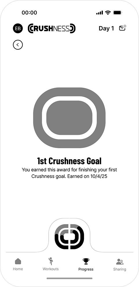
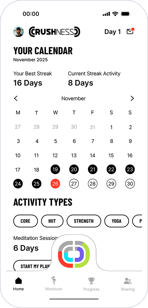
Progress
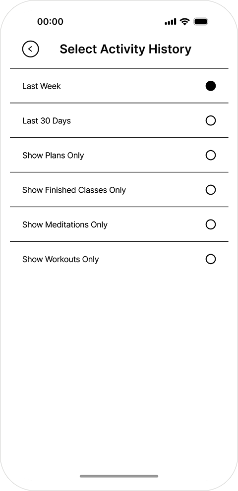
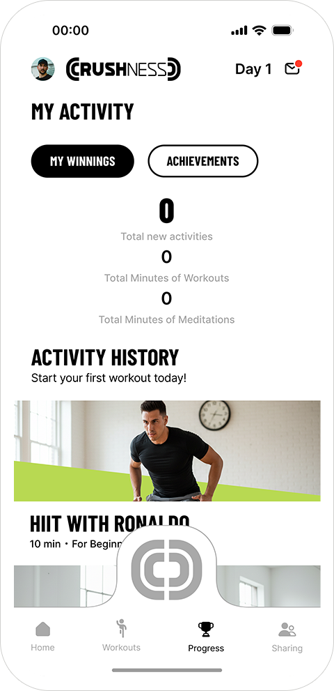
Two layers:
My Winnings - activity history, filters, totals.
Achievements - a medal system that gamifies consistency in a clean, adult way.
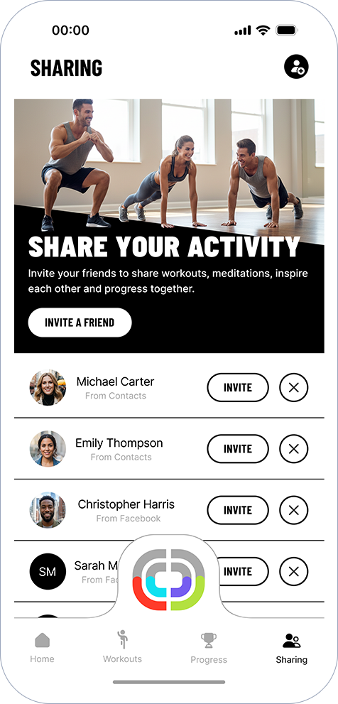
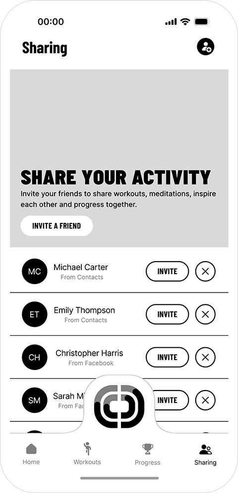
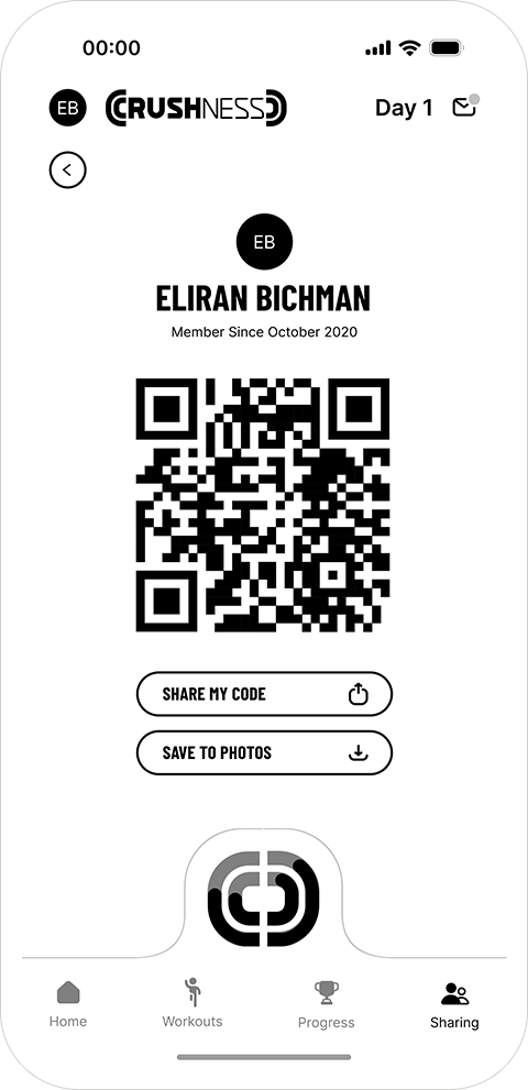
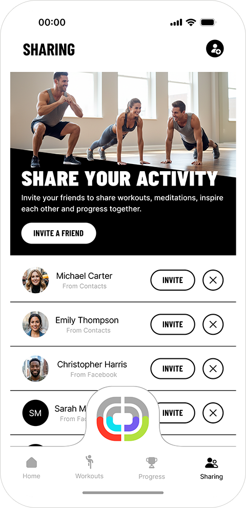
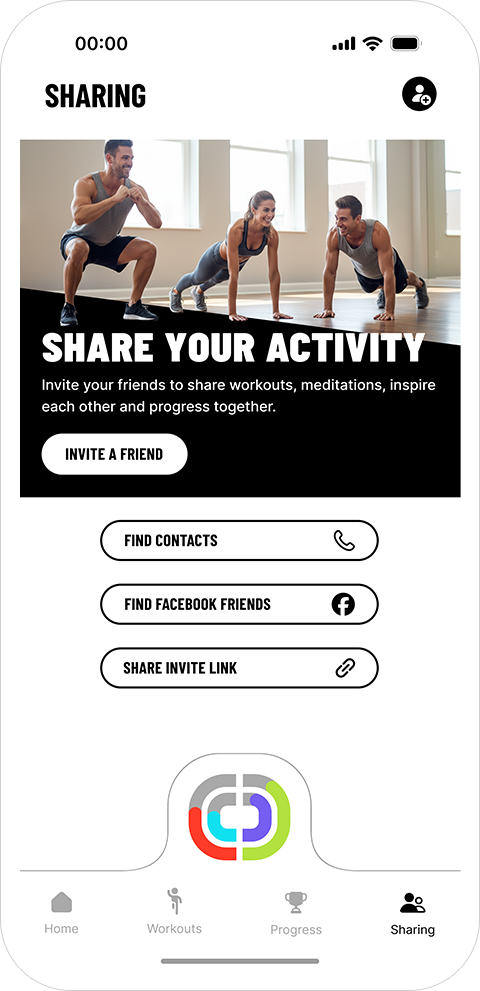
Sharing
Simple and social: invite friends via contacts, socials, or QR code to build accountability loops.
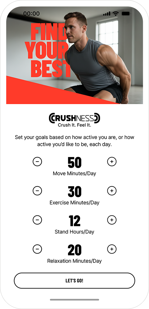
At the center is the Arches Hub - a dedicated daily or weekly view with streaks, timestamps, and goal editing. It’s where the emotional motivation happens.


How I Built It
This project reflects a complete end-to-end product process:
1. Research & Competitive Mapping
I created a FigJam board with references from Nike Training Club, Apple Fitness, Strava, iFit, and Peloton.
I analyzed navigation structures, engagement loops, and layout patterns, identifying what works, what overwhelms, and where the opportunity for mindfulness sits.
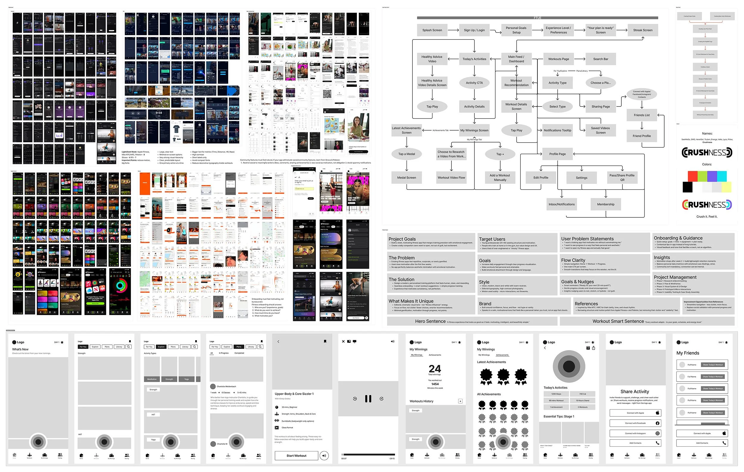
2. UX Structure & Wireframes
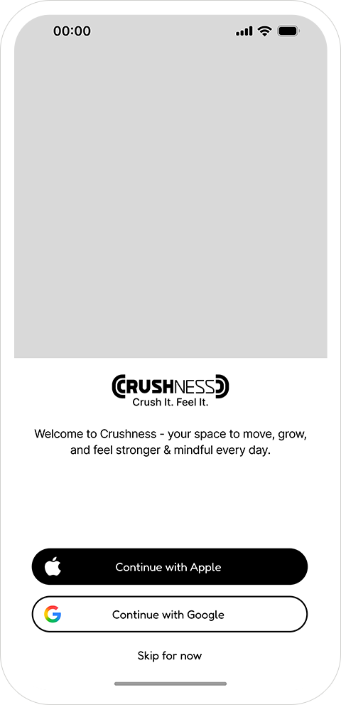
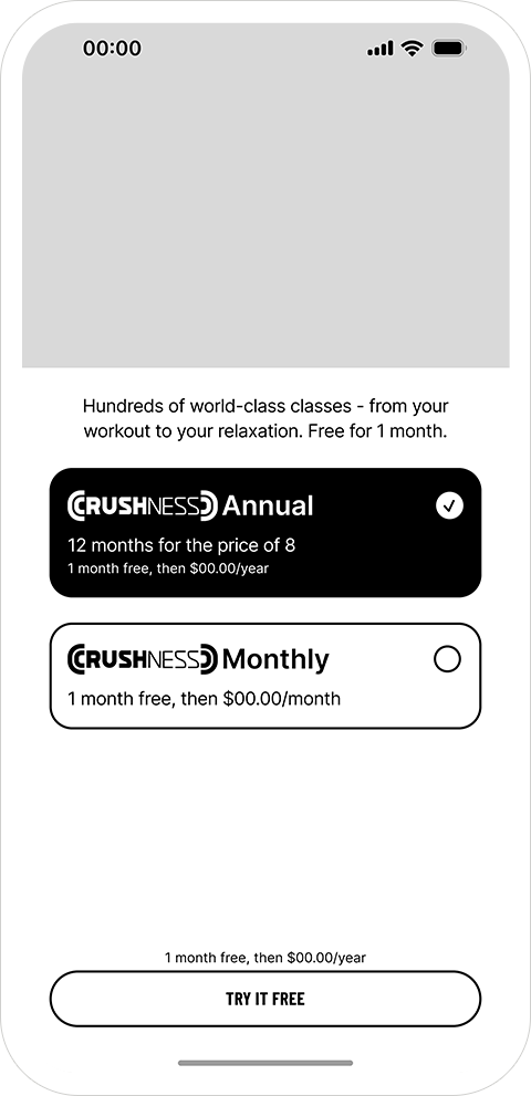
I sketched fast concepts, then built 30 low-fidelity wireframes covering:
onboarding, subscription flow, workouts, progress, sharing, notifications, settings, and the arches hub.


These wireframes turned into a clear user flow map showing how the app behaves end-to-end
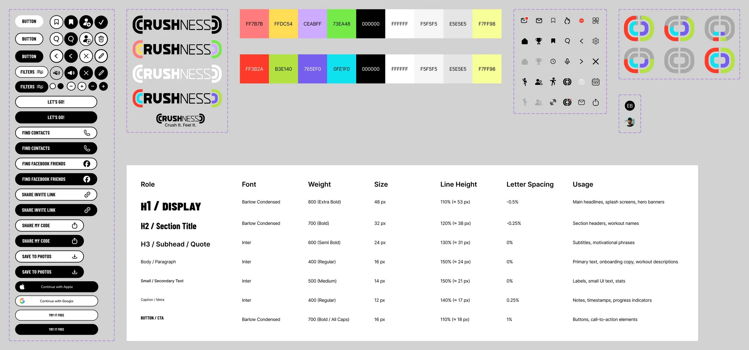
3. Design System
I built a compact system with:
typography hierarchy
4 core colors (the arches)
cards, icons, buttons, chips, filters
workout cards & achievements templates
The palette is almost entirely grayscale, letting the arch colors carry all emotional weight and brand energy.
4. High-Fidelity Design
I refined trainer imagery, improved the text hierarchy, unified spacing, and ensured every screen feels part of one cohesive, premium fitness brand.
This was also my first fully AI-assisted project - using Gemini, Midjourney, ChatGPT, Firefly, and Figma AI to accelerate ideation and imagery, while keeping product decisions human-driven.


What Crushness Demonstrates
This project shows that I can:
Design consumer wellness products with structure, depth, and retention in mind.
Apply B2C product thinking (progression, rewards, streaks, emotional feedback).
Own the entire lifecycle: research → flows → low-fi → design system → visual design.
Use AI as a powerful creative partner without losing clarity or intention.
Crushness is proof that I don’t just design screens,
I design systems that create motivation, habit, and long-term engagement.