HiKnowIT! - Gamified Health Companion
Executive Summary
Stadium Science had a functional, dashboard-heavy health app. I reimagined it as a character-driven, gamified experience that turns daily health actions into quests, rewards, and progression. The result: a concept prototype with a clear core loop, cohesive UI system, and hi-fi screens that make health insights engaging and habit-forming.
My Role
I led the concept end-to-end across product, UX, and UI - defining the strategy and core loop, translating health behaviors into a clear information architecture and quest system, and designing a cohesive, componentized UI language anchored by Dr. Know. I delivered flows, wireframes, and annotated hi-fi prototypes, shaping interactions, economy, and FTUE to maximize clarity, engagement, and feasibility.
Context & Objectives
This is a concept project for Stadium Science. We set out to replace static dashboards with a playful core loop grounded in behavior design.
Goals:
Deliver clear, actionable health insights (diet, sleep, medical status, body metrics) via phone + wearables.
Drive daily return and learning through a lightweight game loop, a guide character, and positive reinforcement.
Old Design
New Design

Approach
Research & Moodboard
We built a broad moodboard and UX references (Duolingo, Finch, Ahead, Rise, Tolan, Sleepagotchi). We sketched early flows and narratives in FigJam, exploring how to map health behaviors into quests, events, and rewards.
Experience Principles
Play over dashboards: replace passive reading with interactive steps.
Daily momentum: streaks, timed quests, light-weight rewards.
Progressive disclosure: insights when relevant, not all at once.
Zero-friction FTUE: learn by doing inside the core loop.
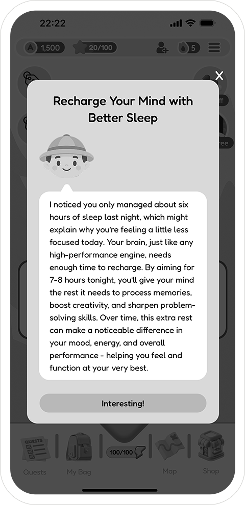
Character-guided: a friendly voice turns data into advice and action.
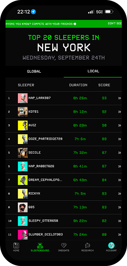
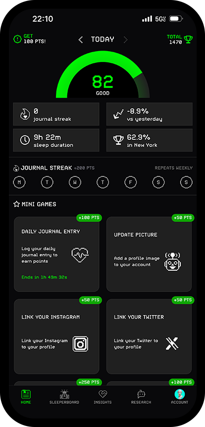
Core Loop & IA (Information Architecture)
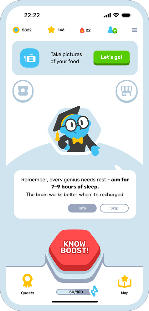
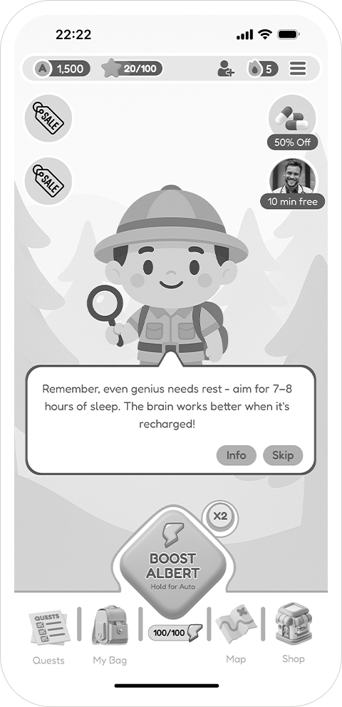
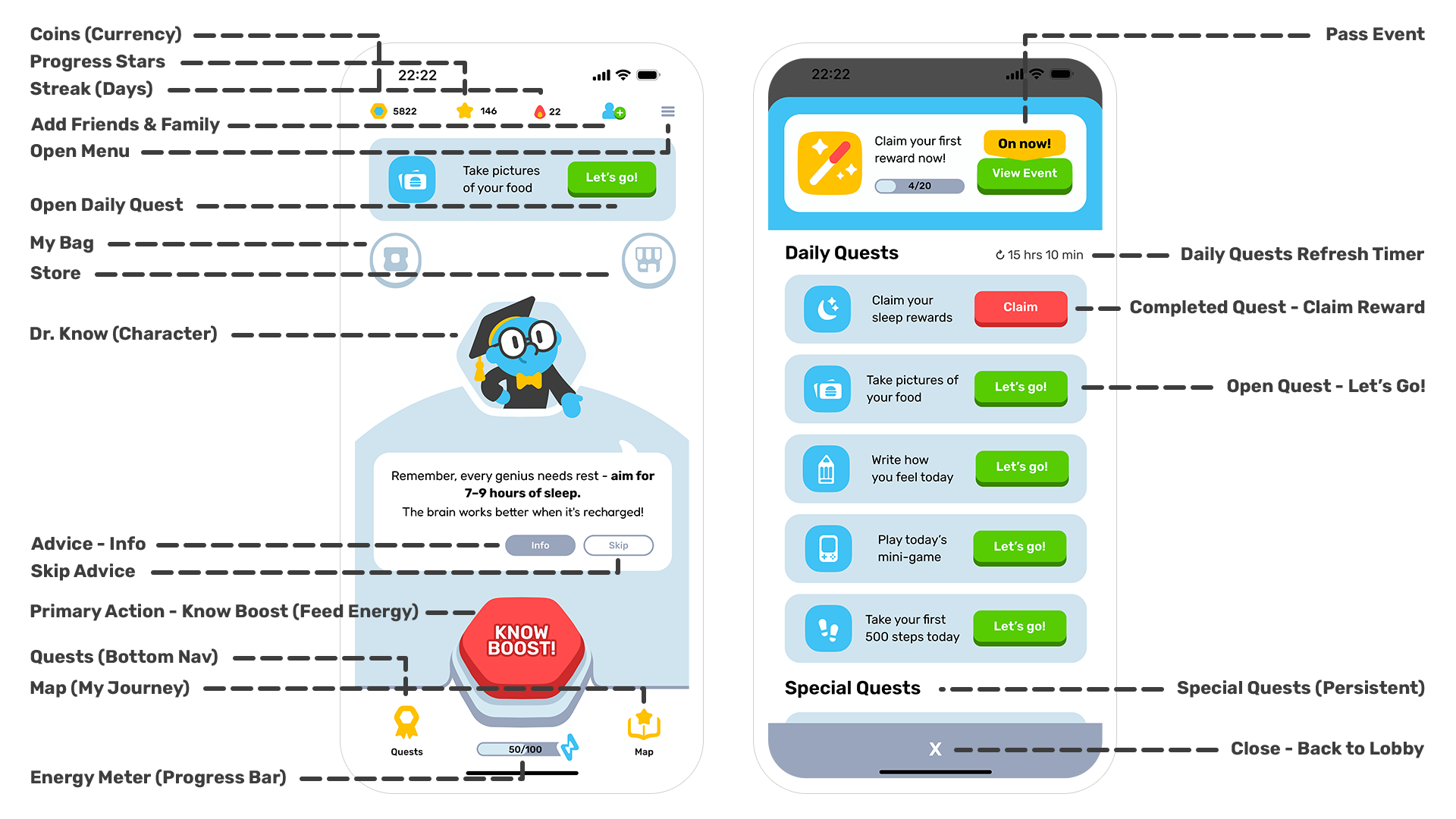
Lobby (Game Hub)
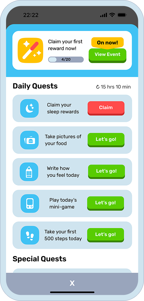
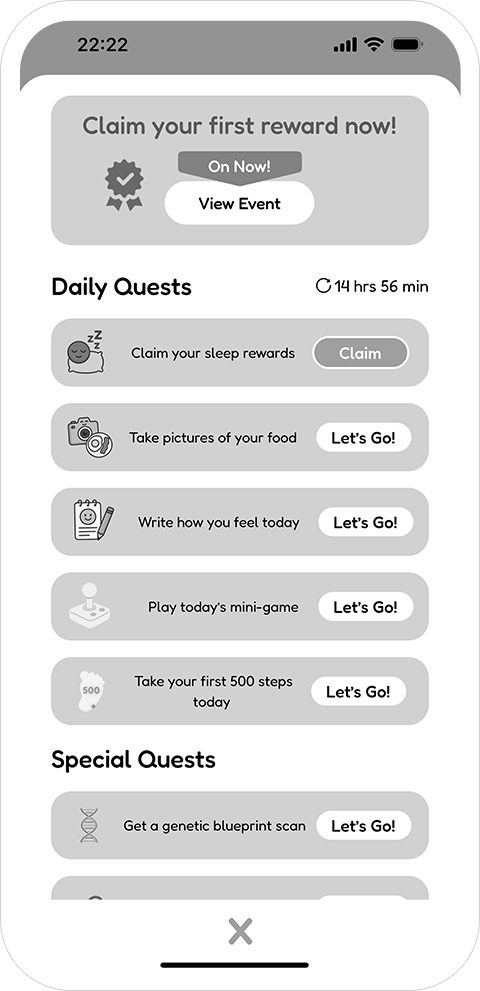
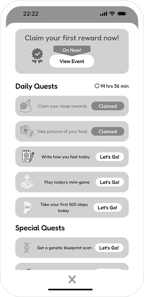
Daily Quest
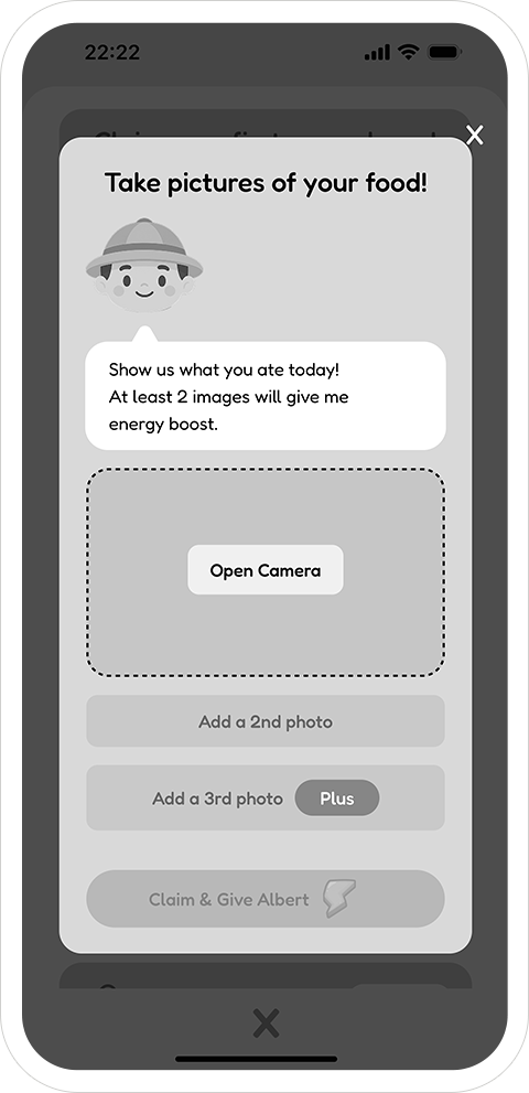
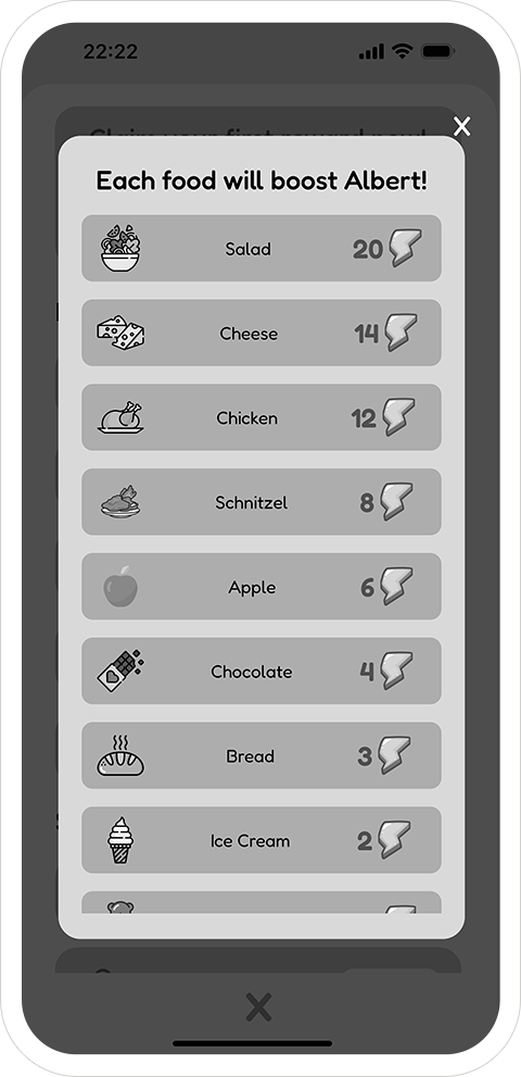
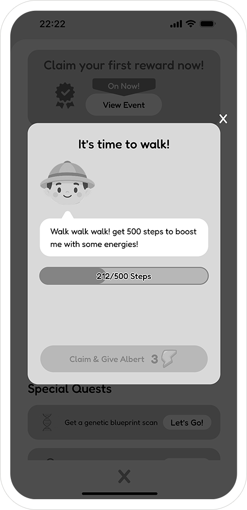
Complete Health Actions
Earn Energy
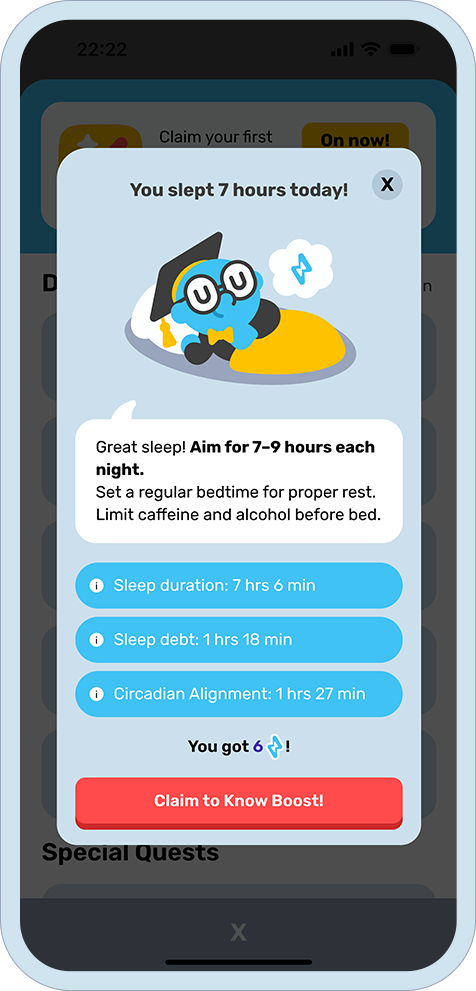
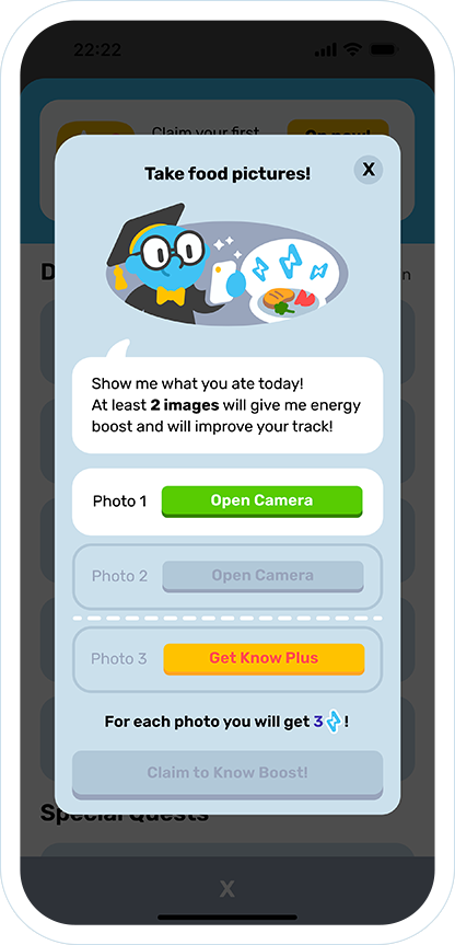
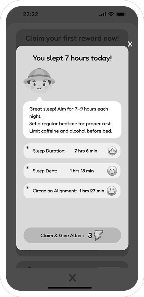
Know boost
Stars/Pass Progress
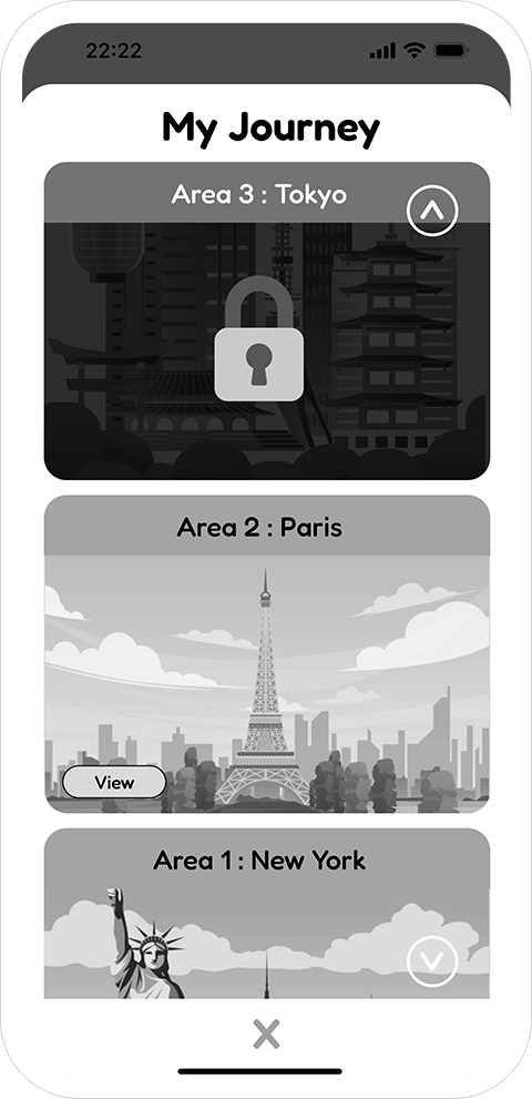
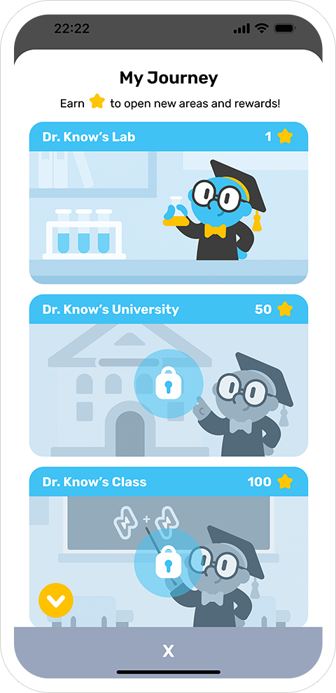
Map (My Journey)
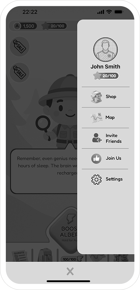
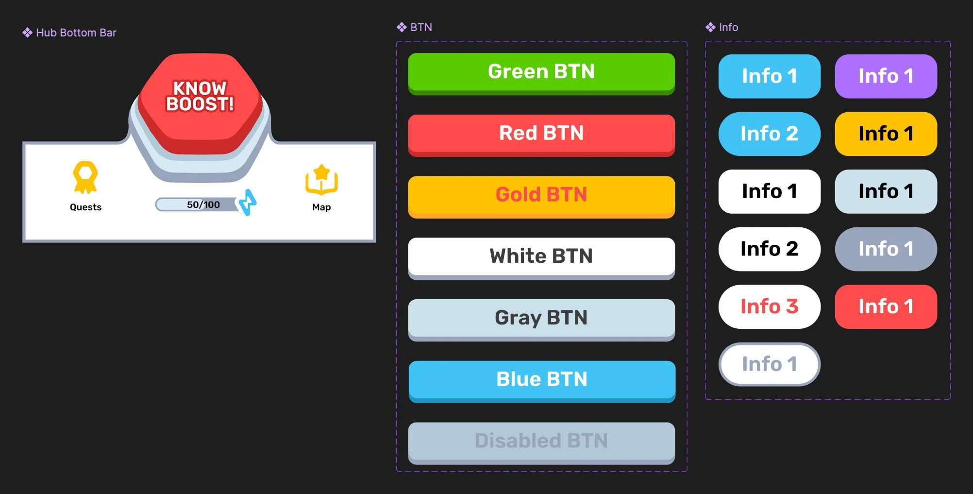
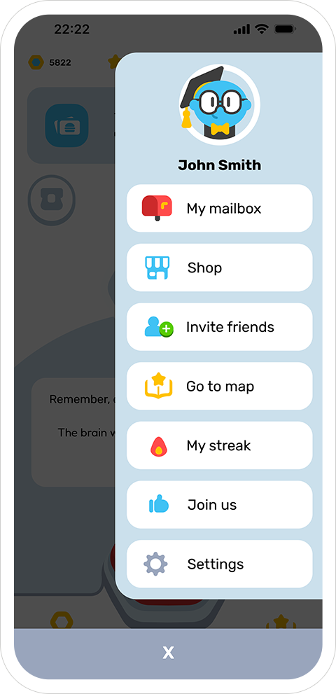
Short paths to Quests and Map from the bottom bar; Store and My Bag are one tap away.
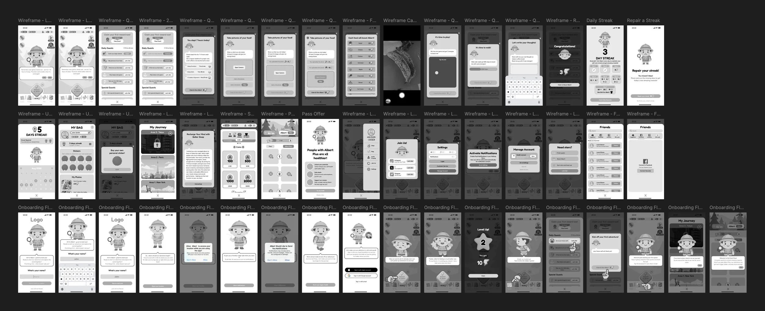
This board compiles all references, flows, initial wireframes, and concept sketches to kick off a focused conversation about what we want to build.

Wireframing the Product
We first explored an “Explorer” theme, then converged on a character-centric approach.
Wireframes defined:
Lobby / Game Hub as the persistent anchor.
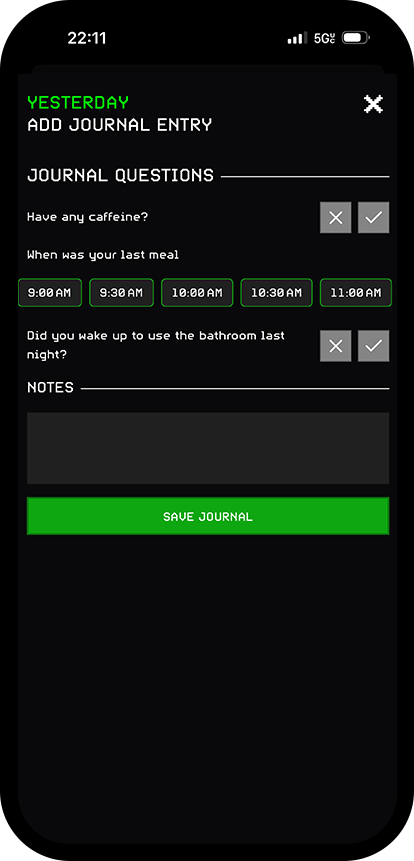
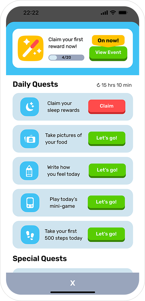
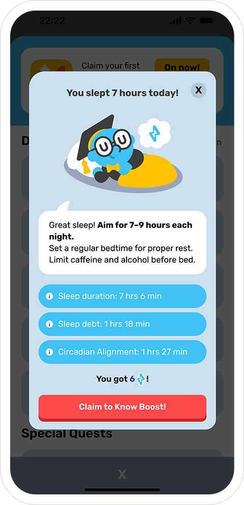
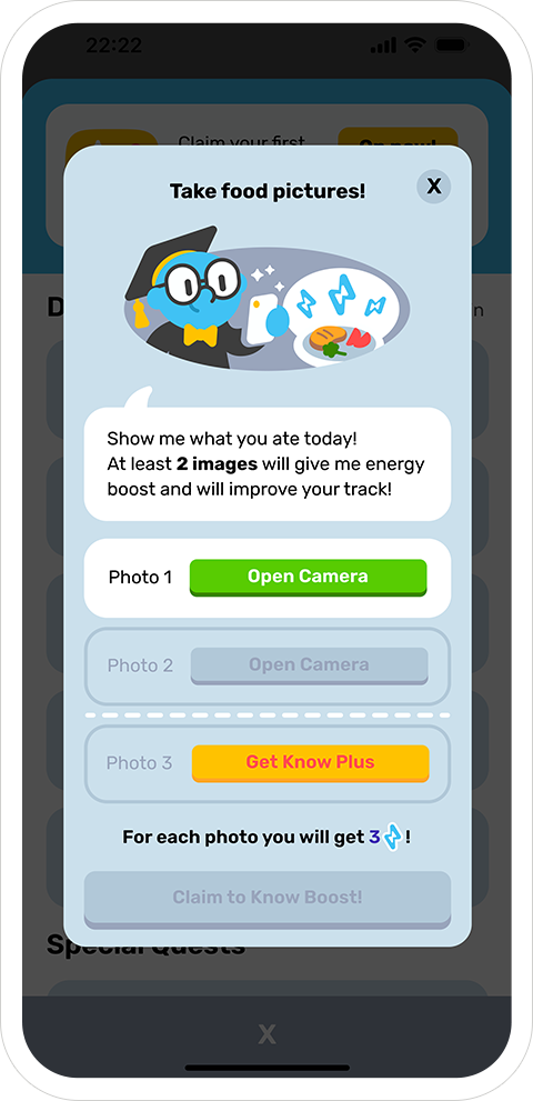
Quest system (daily vs. special) tied to real behaviors: sleep, food photos, steps, mood log, mini-game.
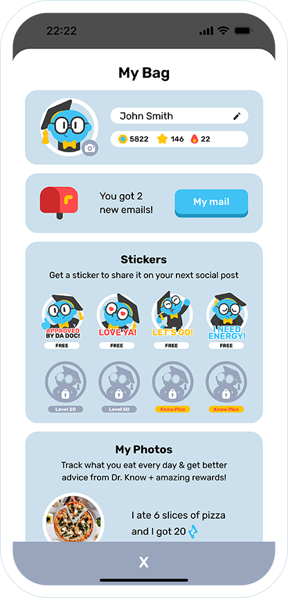
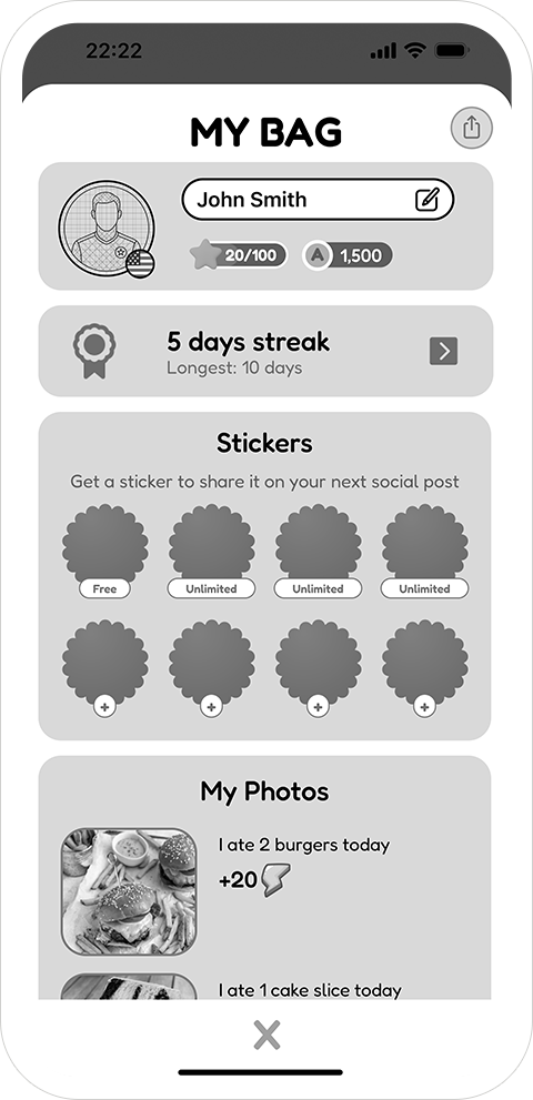
Supporting surfaces: My Bag (inventory/log), Store, Friends & Family, Pass Event, Streak.
FTUE: teach the loop inside the loop (no tour walls).
First, a high-level screenshot of the wireframes board to show scope and structure, then a gallery to explore the individual screens up close.

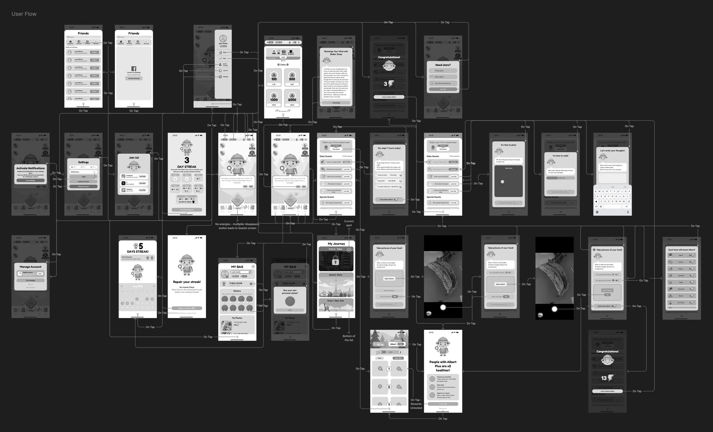
Core experience: the initial user flow mapped from the wireframes:
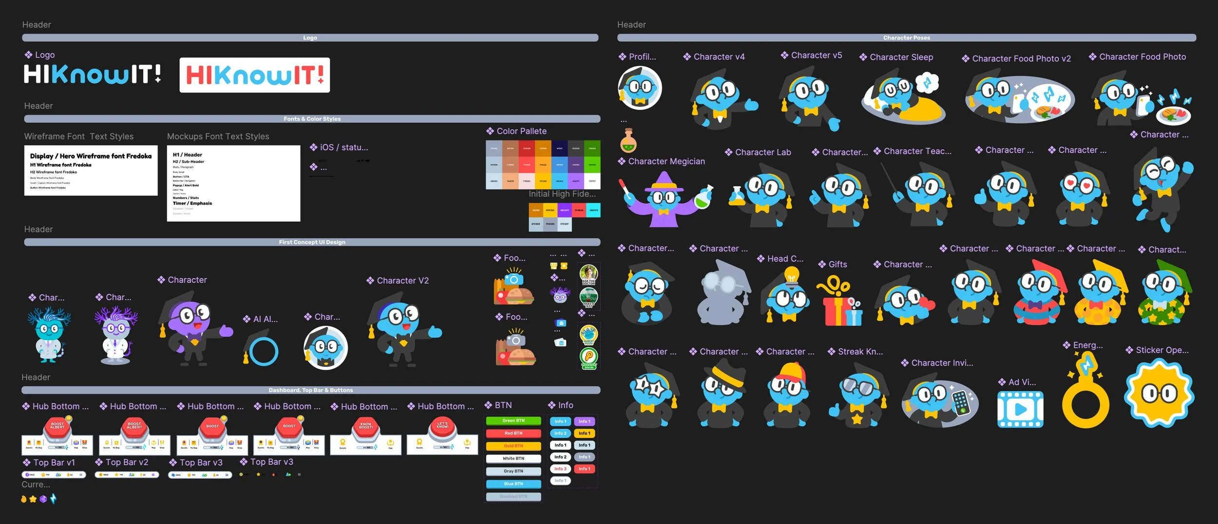
Visual System & Character
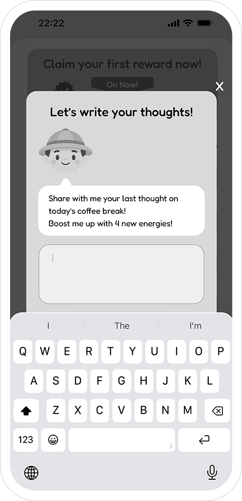
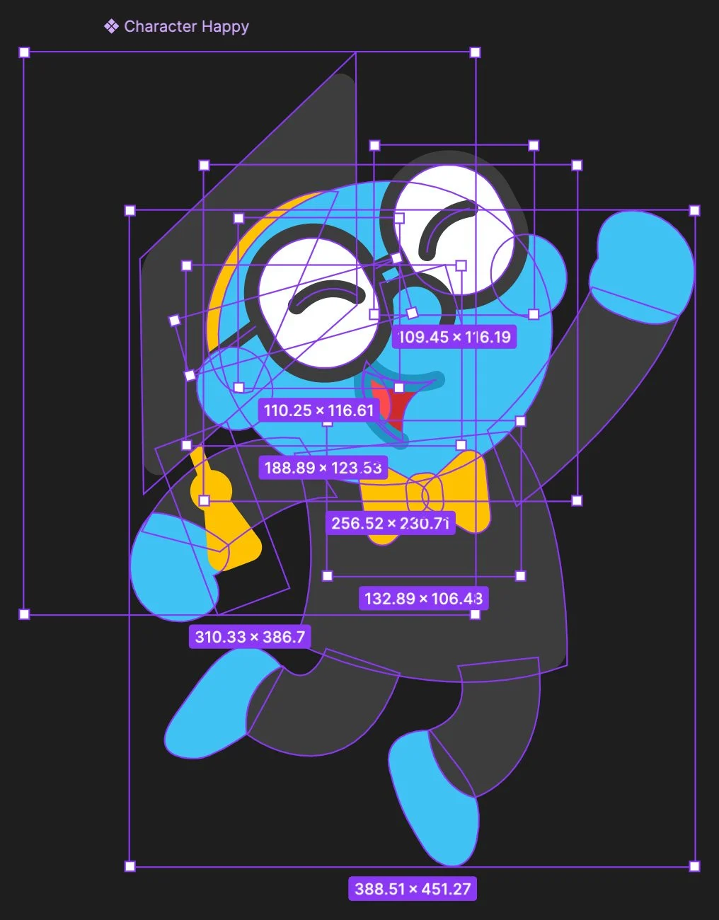
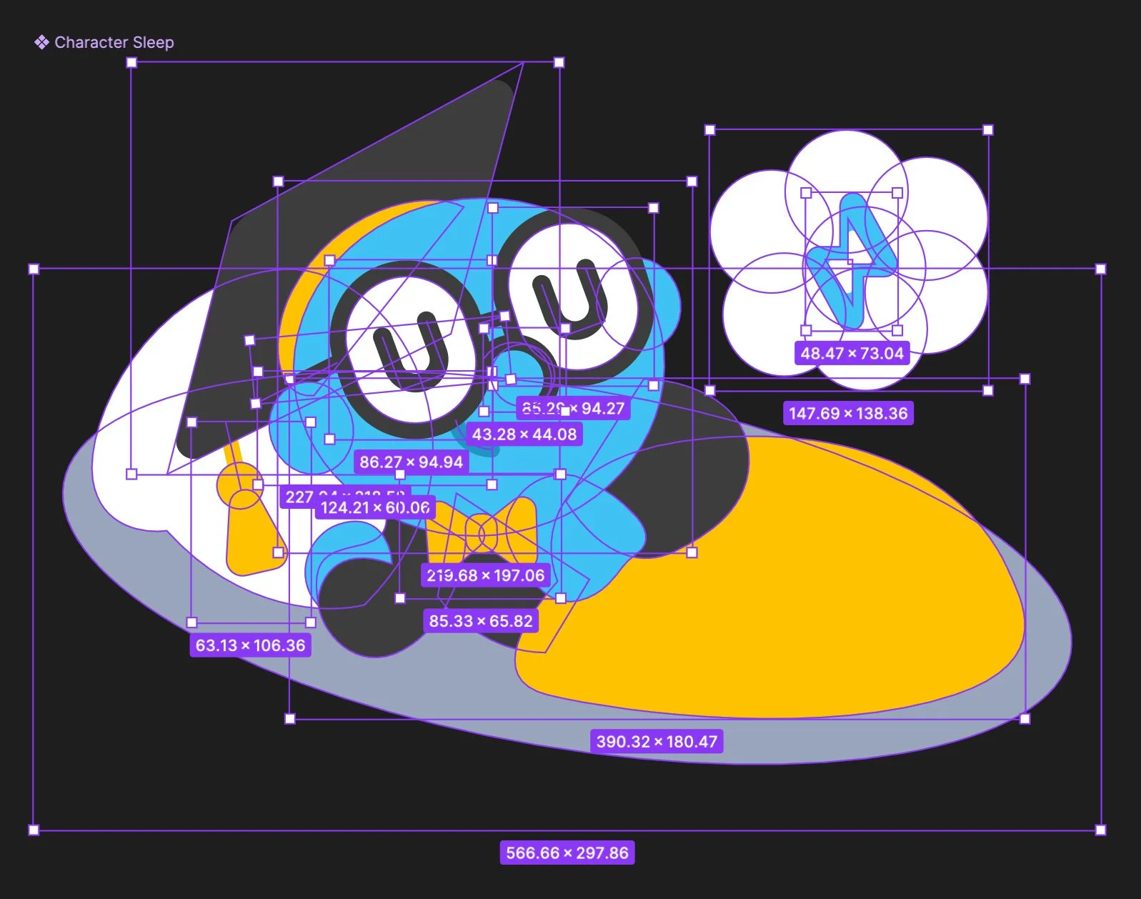
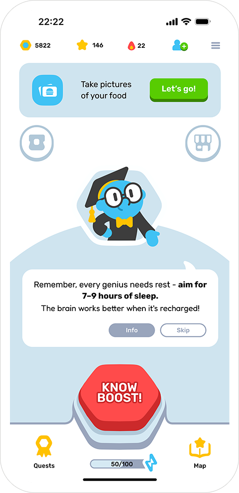
I created Dr. Know - a professor-guide who delivers advice and rewards. I designed the character in Figma and established the design language: typography, color system, and reusable components for cards, popups, tabs, progress bars, badges, and drawers.
High-Fidelity Experience — Flow Overview
The prototype distills the experience into a clear loop:
Lobby → today’s quest & Dr. Know tip → complete real-world actions (sleep, meals, steps, mood, mini-game) → earn energy → trigger Know Boost → gain stars & event tokens → unlock areas on the Map.
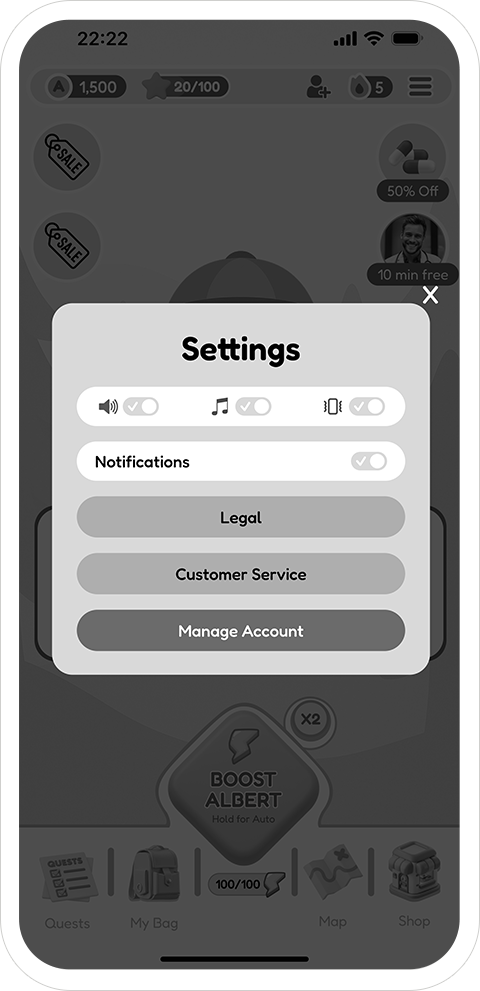
Supporting surfaces follow consistent patterns: sheets for Quests/Bag/Store, modals for rewards and Know Plus, a bottom bar for Quests/Map, and a lightweight menu for everything else (See gallery below).


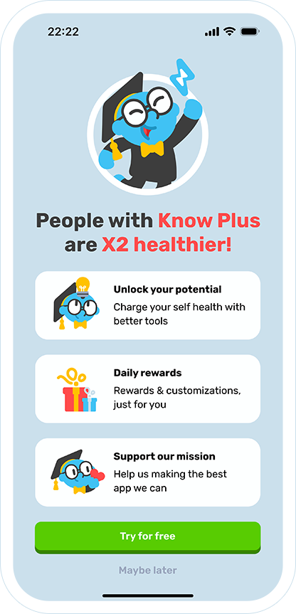
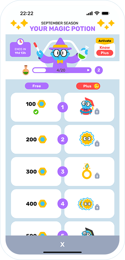
Monetization & Engagement - At a Glance
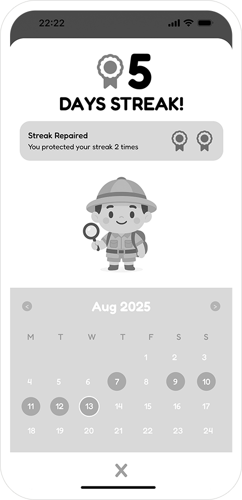
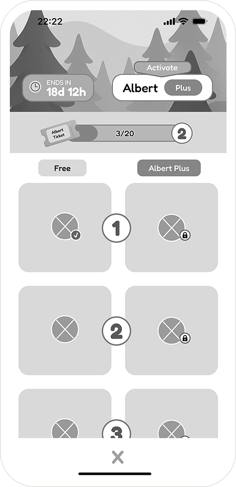
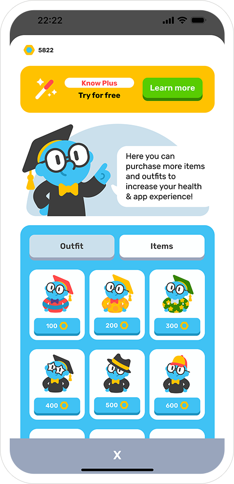
Aligned economy: coins (shop), stars (progress), streak flame (return). Clear sources/sinks tied to play.
Seasonal cadence: monthly Pass with Free/Plus tracks, tokens earned via quests and Know Boost.
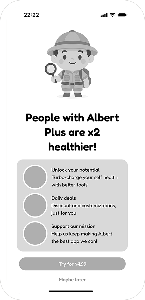
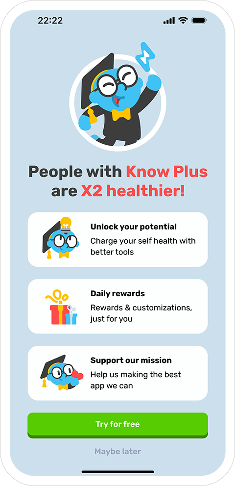
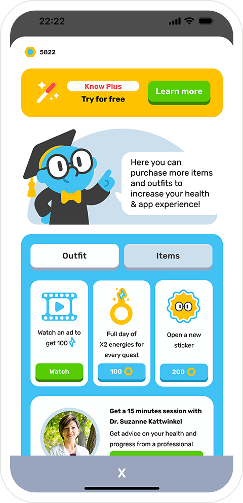
Subscription, not blockade: Know Plus accelerates value (extra slots, better rewards) without locking core features.
Retention loop: daily streak & repair, learn-by-doing FTUE, and short, contextual advice from Dr. Know.
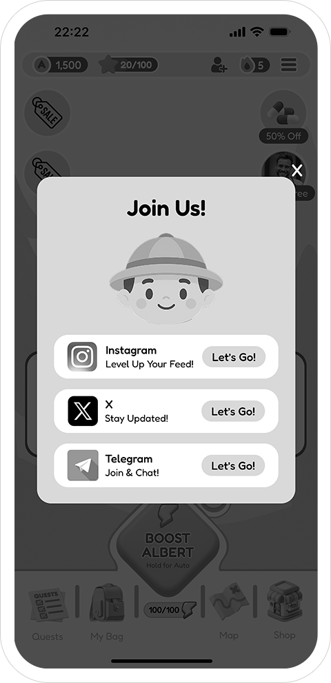
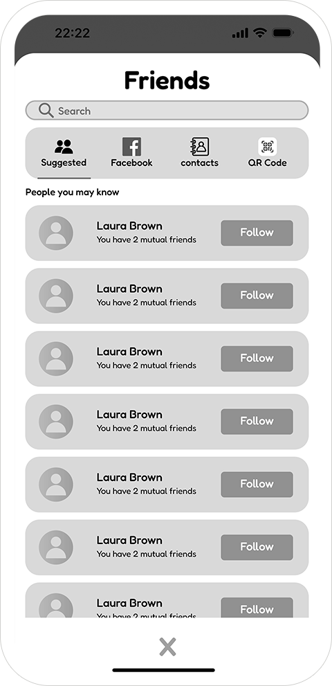
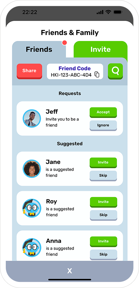
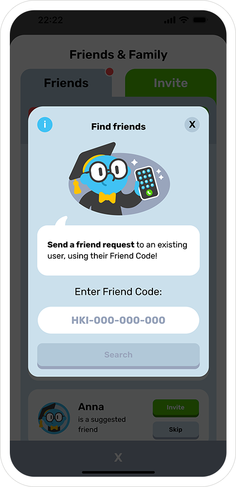
Light social: Friends & Family with codes, requests, and simple discovery to keep momentum.


Iteration & Learnings
Surfacing the daily mission on the Lobby reduced friction and clarified “what to do now.”
Know Boost became an emotional anchor that turns effort into visible progress.
The Store evolved from generic IAPs to economy-backed choices (cosmetics, boosters, services).
FTUE moved from upfront instruction to embedded guidance via Dr. Know and quests.
We focused the MVP loop while keeping space for scalable systems (events, social, stickers).
Outcome
A complete concept prototype that demonstrates how product design + UX + game mechanics can transform health tracking into a habit-forming companion.
Deliverables include a full UI system, a playable core loop, and hi-fi screens ready for stakeholder review or usability testing.
Full board: all hi-fi mockups with explanations, plus legacy app screens and my concept explorations.