Designing for Long-Term Engagement
Map of Maps Screen
Overview
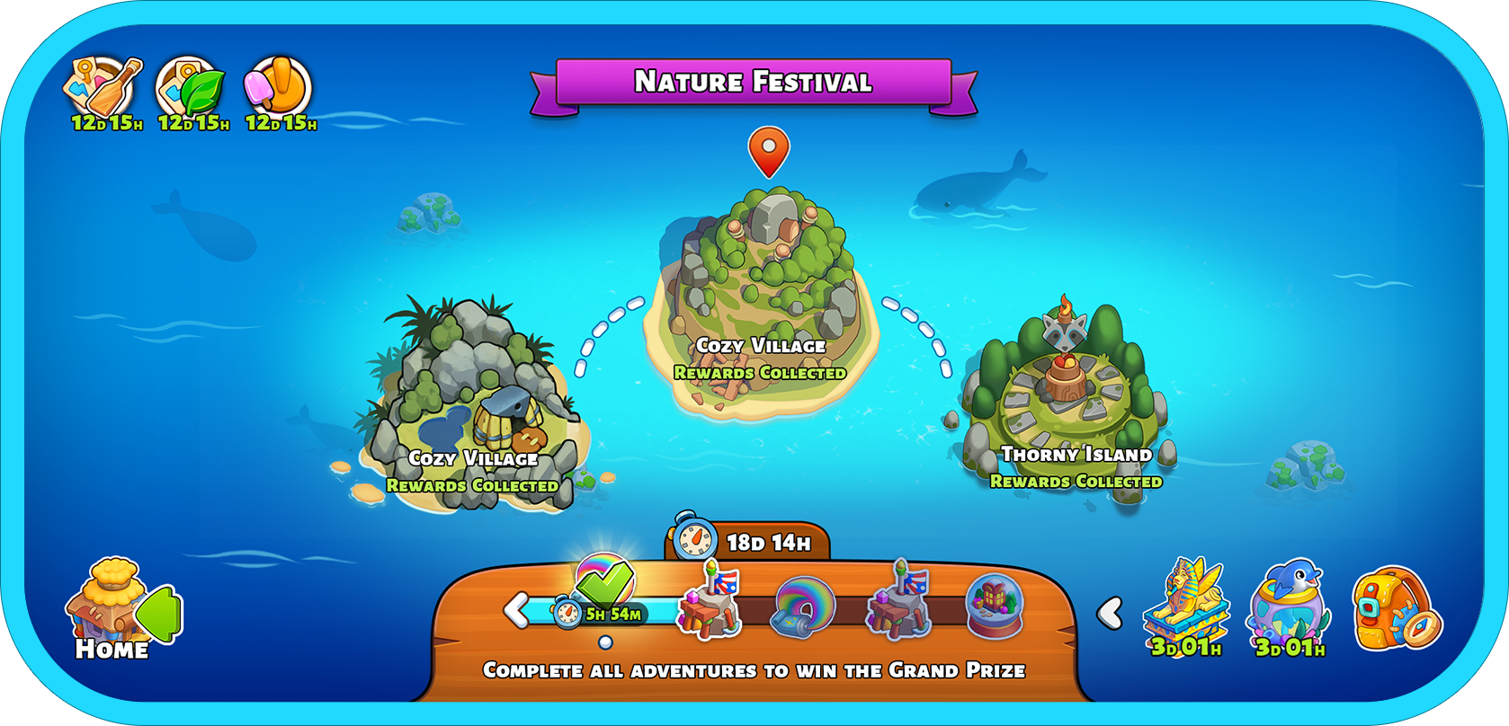
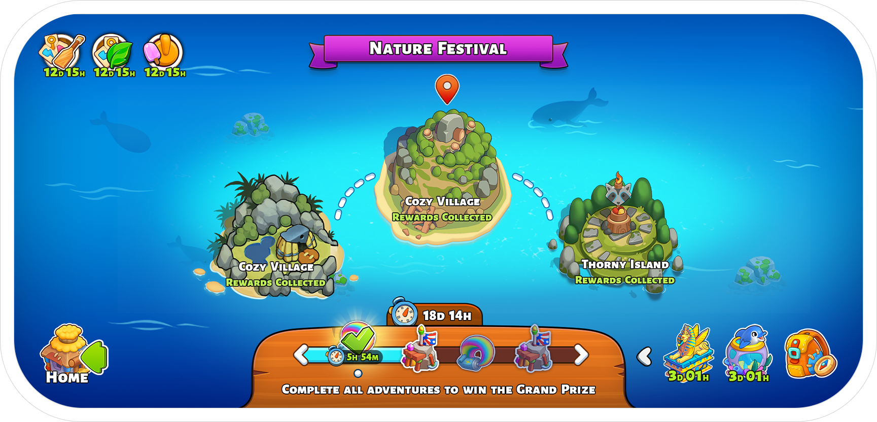
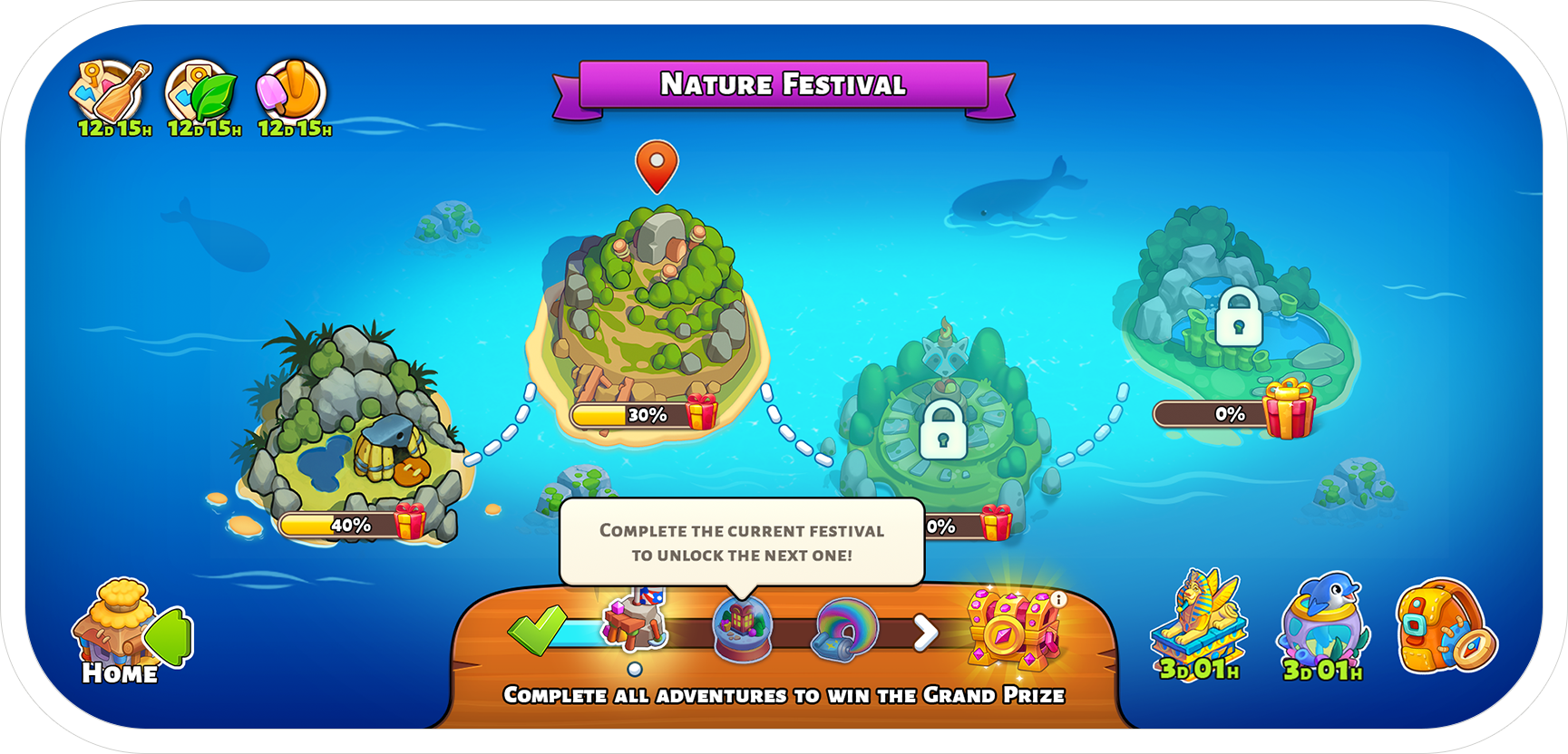
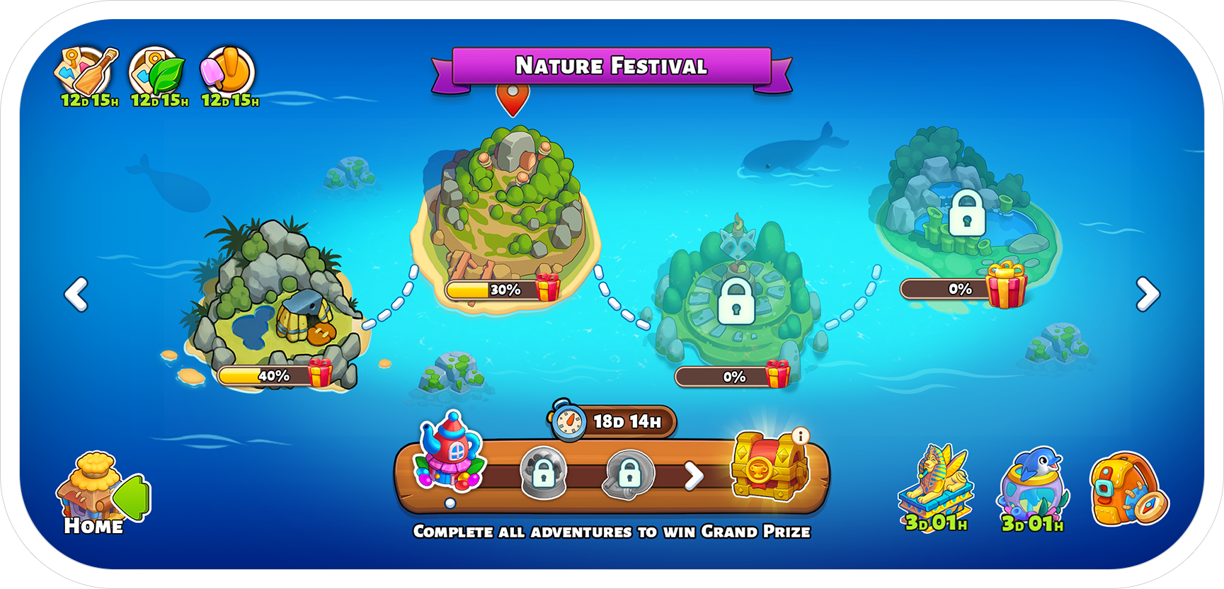
In Family Island, the Map of Maps screen serves as the main navigation hub - connecting players to the current adventure islands, the Home Island, and occasional Expeditions. However, we identified a key retention issue: advanced players would complete all event content within 1–2 days and then drop off, despite the event lasting 3–4 days. This case study showcases how we restructured both UX logic and UI layout to support continuous player engagement.
My Role
Product Design Lead - I led the UX/UI vision and managed a team of 11 designers and animators.
UX/UI Design - Created wireframes, mockups, and multiple visual concepts for the new dock and supporting systems.
Design Research - Collaborated with Market Research team to study reference games, retention curves, and visual metaphors to guide our solution.
Check Out Family Island
Company
Moon Active
The Problem
The original UI displayed only one active festival at a time. When players completed it early, they were left with no reason to return until the next one unlocked.
We saw an opportunity:
Rather than release one event every few days, what if we opened a progression path of multiple events, each unlocking when the previous one was completed?
Our Goal
Allow players to advance at their own pace through a chain of events
Prevent drop-off after early completion
Support this new logic with a UI that clearly communicates progress and unlocks

Design Solution
Updated Dock for Event Progression
We redesigned the floating UI dock into a fixed wooden panel, visually “anchored” to the bottom of the screen - better integrated with the game's wooden/tribal aesthetic.
Each icon now represents an entire festival, not a single island
Future events appear in grayscale and unlock progressively
Completed events remain accessible for a limited time (e.g., 24 hours)
Clear Visual Hierarchy
Home Island remains in the bottom-left corner
Active Festival Islands continue to be shown in the center of the screen
Expedition Islands & Special Adventures (e.g., Ocean Adventure) are accessed via floating icons on the right
Progress as Motivation
The horizontal dock now works like a progress bar - encouraging completion. Players can see how far they’ve come and how many events remain in the chain.


Design Exploration
We explored multiple visual directions:
A raft-shaped dock, referencing the family’s journey to the Home Island
3D wooden docks with higher fidelity and shadows
However, we found these versions drew too much attention and conflicted with gameplay clarity.
We ultimately chose a friendly 2D wooden dock - stylized, minimal, and aligned with the game’s look and feel.


Results
This redesign led to a 40% increase in player retention during active festivals.
By supporting multiple event chains, we transformed the gameplay from a short burst into a longer, more satisfying journey - without requiring additional daily content drops.
